Chapter 23: Digital Composition and Multimodal Texts
Almost every aspect of our communication is in some way, digitally based. To be a writer in the 21st century means that you are a digital composer. Digital composition involves writing based in digital creation that incorporates multimodal elements. If you type your research essay on a computer using Google Docs, then you are a digital composer. But digital composition goes beyond the standard essay typed into a word processor—it includes using other digital tools and elements to explore the topic and persuade your audience.
To begin with, most digital texts are considered multimodal. In this chapter, we will discuss multimodality within the digital composition realm, but you should know that multimodal texts can be created without a digital device.
What Are Multimodal Texts?
Multimodal texts utilize sensory elements to further their rhetorical purpose and persuade an audience. These elements can include audio, visual, and/or physical. You can create a multimodal text using a digital technology tool, but you can also create a multimodal text by hand as well. The following are some examples of digital multimodal composition:
- Infographic
- YouTube video
- Podcast
- Website
- Blog
- Text message
- Word Document
And since we’re looking at types of multimodal texts, let’s also look at some examples of multimodal composition that take place outside of the digital realm:
- Collage
- Poster
- Speech
- Sculpture
- Painting
- Architectural models
The following video, developed for the Arizona State University writing program, discusses how multimodal composition applies to first-year composition courses.
Why Use Digital Composition and Multimodal Texts?
Since our world communicates mostly through digital means, learning how to compose in a digital environment is key to success not only in school but also in your current and future jobs and as a member of society.
In addition to multimodal assignments preparing you for your future writing endeavors, multimodal assignments also allow students to use what they know. Melanie Gagich, in her essay “An Introduction to and Strategies for Multimodal Composing,” writes that students already have knowledge of multimodal composition. She writes in her essay, “Understanding that you are already composing multimodally in many digital spaces will help you transfer that knowledge and experience into your academic assignments. This understanding might also help alleviate any fears or anxiety you may have when confronted with an assignment that disrupts what you think writing should look like” (Gagich 74). If creating a multimodal text seems new to you, chances are you already have an applied understanding of multimodality, just by virtue of living and socializing in the 21st century.
Gagich continues to argue that the most significant reason for learning how to compose multimodally is that it provides “real-life” skills that can help prepare students for careers. The United States continues to experience a “digital age” where employees are expected to have an understanding of how to use technology and communicate in various ways for various purposes. Takayoshi and Selfe argue that “[w]hatever profession students hope to enter in the 21st century . . . they can expect to read and be asked to help compose multimodal texts of various kinds . . .” (3). Additionally, professionals are also using the benefits of digital tools and multimodal composing to promote themselves, their interests, research, or all three. Learning how to create a multimodal text will prepare you for the workforce by allowing you to embrace the skills you already have and learn how to target specific audiences for specific reasons using various modes of communication. (74)
Gagich writes that there are five steps to creating a multimodal text:
- Determine your rhetorical situation.
- Review and analyze other multimodal texts.
- Gather content, media, and tools.
- Cite and attribute information appropriately.
- Begin drafting your text.
Making Visual Choices
According to Foundations of Communication, it may be a cliché to say, “A picture is worth a thousand words,” but visual images have power. Good communication is a multisensory experience. Pre-literate children gravitate toward books with engaging pictures. As adults, we graduate to denser books without pictures, yet we still visualize ideas to help us understand the text. That’s because a strong image in a poem or a story appeals both to the reader’s senses and emotions or intellect. Advertisers favor visual media—television, magazines, and billboards—because they are an effective way to hook an audience. Websites rely on color, graphics, icons, and a clear system of visual organization to engage Internet surfers. Visuals bring ideas to life for many readers and audiences in multiple ways:
- As a link between raw data and usable knowledge
- To provide concrete, vivid, and quick representations
- To save space
- To speak in a universal language
- To be persuasive
Types of Visuals
There are many types of visuals you can incorporate in digital and physical multimodal composition to illustrate and emphasize your point. The rest of this section describes how visuals can support and enhance your ideas in a multimodal text.
Symbols
Symbols include a range of items that can be either pictographic or abstract. In the image below, mathematical symbols and the image of a heart are used to convey the concept of love.

It’s a visual way to represent love, which is an abstract noun that means different things to a wide range of people. While this may not be the first visual you think of when you consider love, it is easy to understand the purpose of the symbols and what they represent
Maps

Maps sometimes include map charts, or statistical maps. In the image to the right, two human palms are displayed, and a map of the world is painted onto them. In the background there is a blue sky with white, fluffy clouds. A map can represent more than geography. This map is a representation of our world, but the image could also speak to lines drawn by humans. One ironic feature of this picture is that the world’s territorial lines are drawn over the lines of two human hands.The image could also speak to matter, how nearly three-fourths of the world is made of water, and how up to 60% of the human body is made of water. Could the image speak to the interconnectedness of all beings on earth? That’s up to the reader to interpret. For more information on how to develop an interpretation you can support in your writing, read the chapter Using Interpretation to Develop Thesis. Images can also persuade. For more information on how to analyze visual rhetoric, read Analyzing Visual Rhetoric.
Graphs and Tables
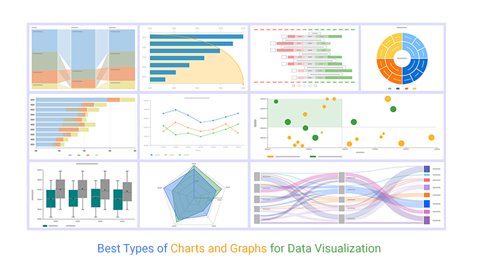
Graphs can take a variety of forms, the most common being line graphs, bar graphs, and pie charts. In the graphs below, the creator uses visual representations to introduce complex information. Graphs are a helpful way to illustrate change visually.

Diagrams
This visual illustrates a process. One example of a diagram would be a flow chart. The diagram below illustrates a workflow process.

Photographs
Photographs (still or moving) depict concrete objects, tell a story, provide a scenario, and persuade an audience.

In the image to the right, a picture of a baby is displayed clearly on a smart phone in the foreground. In the background of the picture, an elderly woman smiles, and her face is blurry. There is contrast between the baby whose image is clear, and the woman whose image is blurred. The contrast piques the viewer’s interest. Contrasting images, colors, and subjects can draw a reader into an image force them to ask questions. For more information on using contrast in images, read over Chapter 18.2.
Illustrations

Illustrations can be realistic or abstract. The illustration pictured to the right displays a cartoonish picture of a Polaroid camera, the iconic camera from the eighties. For some readers, the illustration may invoke nostalgia, while for younger viewers, the camera may have a slightly historical feel. The reception of the illustration varies depending on the audience; regardless, the illustration can help persuade a wide range of audience members.
Why Use Visuals?
There are a number of reasons you might consider including visuals in documents, presentations, and other communications. Four reasons are detailed below:
Decorative: Visuals that do not represent objects or actions within the text but are added, instead, for aesthetic effect are considered decorative. Decorative visuals are often added to gain attention or increase the audience’s interest. Visuals can be used this way but can detract from the message you are trying to communicate and, thus, should be used with caution.
Representational: These visuals physically represent or physically resemble objects or actions in the text and are relevant to the content of the text. For example, rather than giving a detailed textual description of a new playground, you might include an image or render of the new playground and use the text to highlight specific features or information.
Analogical: Analogical visuals are used to compare and contrast two things, and explain their likeness or correspondence. For example, a marketing consultant might try to clarify the difference between targeted marketing and mass marketing by including images of a single fisherman with a single fishing rod and line next to an image of a bigger boat with a fishing net. By using the fishing analogy, the marketing consultant is attempting to connect a possible prior understanding of the audience, a visual, and the concepts of targeted marketing versus mass marketing.
Organizational: The purpose of organizational images is to provide structure to information, visually define relationships, and illustrate connections. A chart of the hierarchical structure of a company is one example of an organizational image.
| Communication Purpose | Consider These Visuals |
| Depict an object | Photo, 3D Model, Illustration |
| Persuade an audience | Photo, Illustration, Chart (showing statistics) |
| Demonstrate a procedure | Photo, Illustration, Flowchart |
| Explain a process | Diagram, Symbol, Illustration |
| Make comparisons | Bar Graph, Line Graph, Table |
| Demonstrate trends or data | Line Graph |
| Organize information | Map, Table |
Table 23.1 Communication Purposes and Visuals
There are many considerations to keep in mind when choosing visuals. When possible, use a variety of types of visuals, but remember that any visuals you use should enhance the content of the text. For example, only add photos if viewing the photos will clarify the text. Near each visual, explain its purpose concisely. Do not expect your readers to figure out the values of the visuals on their own.
For repositories of openly licensed photos, you can search Wikimedia Commons and Pixabay. Website creation software like WordPress, social media applications like Twitter, and other types of software like graphics makers such as Canva and video creators like Powtoon have their own repositories of free images you can use as well.
Making Audio Choices
Including audio in your multimodal project can enhance your text and move a reader both logically and emotionally. Audio enhances your message. You may want to consider the following audio choices:
- Music
- Spoken word
- Sound effects
Music: From pop to classical to Bollywood, music can be any use of vocalizations or instrumentals. Music can help convey theme in a video or podcast, and music can help heighten tension and advance plot in a story.
Spoken word: Spoken word audio choices include recording a voice-over of the written text or narration.
Sound effects: Sound effects include any kind of sound, from nature or manmade. Some examples include crickets, glass shattering, or applause. Sound effects can help characterize people and convey action. They can also affect the tone of a text, creating humor or suspense.
National Public Radio develops a wide range of podcasts that integrate music, narration, and sound effects to tell stories. The sample podcast episode aired on the NPR show Hidden Brain.
There are a number of reasons you might consider including audio in documents, presentations, and other communications. According to the Advisory Group on Computer Graphics (AGOCG), using audio in multimedia has the following advantages:
- It can convey meaning, providing an extra channel of information. It allows redundancy to be incorporated into the presentation of information so that if the meaning is unclear to a user using visual information alone, the audio may clarify it.
- Different learners use different learning strategies, and audio can provide additional information to support different learning styles. For example, some users may learn more by hearing than reading a piece of text.
- Audio can add a sense of realism. Cultural associations with music allow you to convey emotion, time period, geographic location, etc.
- It is useful for directing attention to important events. Non-speech audio may be readily identified by users, for example, the sound of breaking glass to signify an error. Since audio can grab the user’s attention so successfully, it must be used carefully so as not to unduly distract from other media.
- It can add interest to a presentation or program.
- Ease of communication: Users may respond better to the spoken word than other media. For example, in a company presentation, ‘sound bytes’ from satisfied customers can be used.
The AGOCG also writes that there can be disadvantages to using audio:
- Like most media, files can be large.
- Audio can be easily overused, and when sounds are continually used users tend to tune them out.
- For most people, audio is not as memorable as visual media.
- Good-quality audio can be difficult to produce, and like other media, most commercial audio, particularly music, is copyrighted.
- Users must have appropriate hardware and software.
Accessibility
Being a digital writer means that you have to be consciously aware of your audience and their ability or inability to participate in the texts that you create. Not everyone can view a meme or infographic and not everyone can hear the sound on a YouTube video.
Closed Captions
Whenever possible, include captions for all videos that you create. This allows those who are hearing-impaired and deaf to access your message. You can edit the videos yourself to add captions, or you can use a platform like YouTube that will auto-generate captions that you can edit.
Audio Description
If you are making a video that contains scenes with any type of action, you will want to create an audio description.
Transcript
For any type of audio or video, you want to consider including a transcript of the spoken dialogue.
Alternative Text
For any photo or graphic you include in your text, make sure to provide alternative text by right-clicking on the image in Word and then selecting edit Alt-text. Using alt-text is a principle of web accessibility. Users with screen readers will read an alt attribute to better understand an on-page image.
Design Principles for Print and Digital Media
With multimodal composition, creators have the opportunity to use multiple modalities to present information. Once you have chosen an audience for your text, it is time to choose a genre and begin creating using modalities including audio, visual, linguistic, and spatial, among others! In this chapter, we share some popular multimodal texts with tips on how to create them.
There are three principles to keep in mind when you are creating any multimodal text:
- Keep it simple.
- Make it accessible
- Follow CRAP design principles
Academic and Professional Papers
Just because academic writing is often text-based, that doesn’t mean that there are no options for multimodality! One of the principles of multimodality is visual presentation. You can absolutely present your work visually using a variety of tools found in a word processor like Microsoft Word or Google Docs to create a multimodal document that is appropriate for any academic or professional setting. The following tips will help you design a document that is aesthetically pleasing while sharing information that is more accessible to your reader.
Example of Multimodality: Scholarly Text
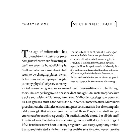
Here is in an example of a standard scholarly book in a print edition. This text relies primarily on the linguistic mode. In other words, it is made up primarily of letters and words. However, because most texts are multimodal in some sense, there are at least three modes at work in this example.

- The linguistic mode operates in the printed, written text.
- The visual mode operates in the formatting of the text (such as the use of fully justified margins) and in the choice of typography (such as the different fonts used for the chapter title and the use of brackets around the chapter title).
- The spatial mode can be seen in the text’s arrangement (such as the placement of the epigraph from Francis Bacon’s Advancement of Learning at the top right and wrapping of the paragraph around it).
Font Choices
If the assignment doesn’t specify a font, you can choose one yourself! If your final work will be printed, you would typically choose a serif font—or one that has decorative edges called “feet.” If you are writing for a digital space, a sans-serif font will do nicely and is easier to read on a screen.
This chapter is a synthesis of two different Creative Commons texts:
Sections are written by Anne Turner, published by Central New Mexico Community College, and licensed under CC BY-SA 4.0
Making Visual Choices was adapted from “A Picture is Worth 1000 Words: Using Visuals” in Part 1 of Foundations of Professional Communication CC BY 4.0. Originally published at http://www.procomoer.org/foundations/
Works Cited
Advisory Group on Computer Graphics, “Using Audio in Multimedia,”
Gagich, Melanie. “An Introduction to and Strategies for Multimodal Composing Melanie Gagich.” Writing Spaces: Readings on Writing, Volume 3, licensed under CC BY-NC-ND 4.0, https://writingspaces.org/sites/default/files/1gagich-introduction-strategies-multimodal-composing.pdf


